Shading & Value
Light and Shadow Basics: How to Make Drawings Look 3D
Learn light and shadow drawing from scratch. Understand value, core shadow, and cast shadow to make any object look solid and three-dimensional.
A flat circle becomes a sphere the moment you add one shadow. That single shift from outline to light and shadow drawing is what separates a symbol of a thing from a convincing picture of it. This guide breaks down the logic of light so you can apply it to any object, in any pose, using just a pencil and paper.
Why Light Creates the Illusion of Form
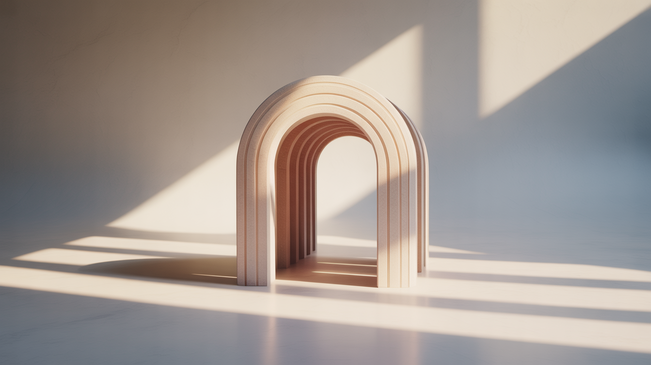
Our eyes read depth through value. Value means lightness or darkness, independent of color. A surface facing the light source appears light in value; a surface angled away appears dark. Our brains have been interpreting this gradient since birth, so when a drawing mimics it accurately, the shape reads as three-dimensional almost automatically.
Two concepts anchor everything:
- Form shadow (also called core shadow): the dark area on the object itself, on the side facing away from the light.
- Cast shadow: the shadow the object throws onto a surface beneath or beside it.
Both are essential. The form shadow tells you the object is solid and has volume. The cast shadow anchors it to a surface and tells you how far it sits above that surface. Drawings that show one without the other often look unfinished or floating.
Choosing and Committing to a Light Source
Before you shade a single line, decide where your light comes from and write it down at the top of your page if you need a reminder. "Upper left, roughly 45 degrees" is enough. Every shading decision follows from that one choice.
A few practical rules:
- One light source is almost always easier for beginners. Two or more create competing shadows that are hard to manage until you understand each one individually.
- Light from above and to one side (top-left or top-right) gives the clearest separation between light and shadow. Directly overhead light is dramatic but flattens many forms; light from directly in front of the object washes out the shadow almost entirely.
- Stick with your choice through the whole drawing. Mixing shadow directions is one of the most common reasons a drawing looks "off" without the viewer being able to say why.
Start with a simple sphere or egg shape. Sketch the outline lightly, note your light source, and draw a small arrow on the page pointing toward your imagined light.
The Five Elements of Light on a Form
Most shading instruction uses five terms to describe what happens across a lit surface. You do not need to replicate all five in every drawing, but knowing the vocabulary helps you look at objects and know what to draw.
- Highlight: the brightest spot, usually closest to the light source. On smooth objects it is a small, bright area. On rough surfaces it is more diffuse.
- Light area (midtone): the broad region facing toward the light. In a pencil drawing, this is often left as lightly worked or near-white paper.
- Shadow edge (terminator): the transition line where the light area ends and the form shadow begins. This is not always a hard line; on a sphere it is a soft gradient.
- Core shadow: the darkest part of the form shadow, often just inside the terminator rather than at the very edge of the object. Beginners often make the silhouette edge the darkest part, which flattens the drawing.
- Reflected light: a subtle lightening at the very edge of the shadow side, caused by light bouncing back off nearby surfaces. Keep this light; if you make it too bright it reads as a second light source.
Practice locating all five on a simple sphere before applying them to complex objects.
How to Shade Light and Shadow in Steps
A structured approach prevents the common mistake of jumping straight to heavy dark marks before the overall values are placed.
- Lightly sketch the object's outline in an HB or 2H pencil. Keep lines loose.
- Mark the shadow edge. Draw a faint curved line separating the light side from the shadow side. On a sphere this line runs roughly perpendicular to the direction your light arrow points.
- Establish your darkest dark. Use a 2B or 4B pencil to lay in the core shadow zone with medium pressure. Do not press hard yet; build up in layers.
- Fill the form shadow broadly. With the same or slightly lighter pressure, shade the full shadow side up to (but not over) the shadow edge.
- Leave the lightest area mostly clean. The light side needs very little pencil work at this stage. Touching it too much too early is a common beginner trap.
- Draw the cast shadow. It extends from the base of the object away from the light source. Cast shadows are typically darkest near the object and fade slightly as they move away.
- Add reflected light. Gently lift or lighten the very edge of the form shadow with a kneaded eraser, or simply leave that zone slightly lighter when you originally shade it.
- Adjust values overall. Step back and squint at the drawing. Squinting blurs detail and makes the big value shapes easier to read. Darken areas that feel too light, and erase or blend areas that feel too abrupt.
For a closer look at pencil pressure and layering, see how to shade with a pencil: a beginner's guide.
Common Mistakes and How to Fix Them
Uniform dark outlines on the shadow side. The silhouette of an object is not necessarily its darkest point. Shift the darkest value inward to the core shadow and let the outline stay mid-value. This alone often adds significant depth.
Ignoring the cast shadow. Without a cast shadow, objects look like they are floating. Even a simple ellipse beneath a sphere grounds it on a surface.
Overworking the light side. The brightest light areas should have almost no pencil marks. If the light side is getting muddy, clean your pencil tip and work lighter, or switch to a harder grade (HB or H) for those zones.
Flat, even shading across the whole shadow. Shadow is not a single tone. It transitions from the shadow edge (slightly lighter) through the core shadow (darkest) to the reflected light edge (slightly lighter again). Even small variations in this zone add a sense of roundness.
Competing light sources. If you find yourself shading from two directions without planning it, stop and decide which light is dominant. Reduce the other to a subtle reflected light at most.
If you want a more systematic way to practice seeing values before applying them, how to draw a value scale and why it matters walks through the process in detail.
Building Texture Into Shadow Areas
Shadow areas are not always smooth. Depending on the surface material, the form shadow might be rough, grainy, or broken by texture. Two shading methods give you control over this.
Smooth blending (using a tortillon or a fingertip) works well for skin, ceramics, or any object with a soft surface. Hatching or crosshatching keeps the shadow area more textured and is often used for fabric, bark, or rough stone. The same form-shadow logic applies either way; only the tool and stroke vary.
For a full introduction to line-based shading, hatching and crosshatching for beginners covers stroke direction, angle, and layering density.
Frequently Asked Questions
Do I need to draw the light source in my sketch? No. The light source is almost never drawn; it exists only by implication through where you place your shadows. A small arrow notation at the edge of your page is a practical reminder, not part of the final drawing.
What pencil grades work best for light and shadow drawing? A basic range of HB, 2B, and 4B covers most needs. HB handles the light side and initial outlines, 2B builds mid-value shadow areas, and 4B adds the deepest darks. You can get a convincing range without anything softer than a 4B when you are learning.
My cast shadow always looks pasted on. What am I doing wrong? Two things help. First, make the cast shadow darkest where it meets the object and slightly lighter as it moves away. Second, the edge of the cast shadow nearest the object is usually sharper; edges farther from the object are softer because light wraps around slightly. Varying the edge quality makes the shadow feel attached rather than stamped on.
How dark should the core shadow be? As a general starting point, aim for the core shadow to be roughly twice as dark as the rest of the form shadow. It should be darker than the cast shadow near the object. That said, the exact relationship changes depending on how much ambient light is in the scene. Work from observation when you can, or place an object under a single lamp and draw what you see.
Is it okay to erase inside the shadow to add reflected light? Yes. A kneaded eraser can lift graphite gently without disturbing the paper surface. Pinch it to a point and dab rather than scrub. The goal is a subtle lightening at the shadow edge, not a white streak. Keep reflected light quiet; it should read as lighter than the core shadow but still darker than the light side of the object.