Shading & Value
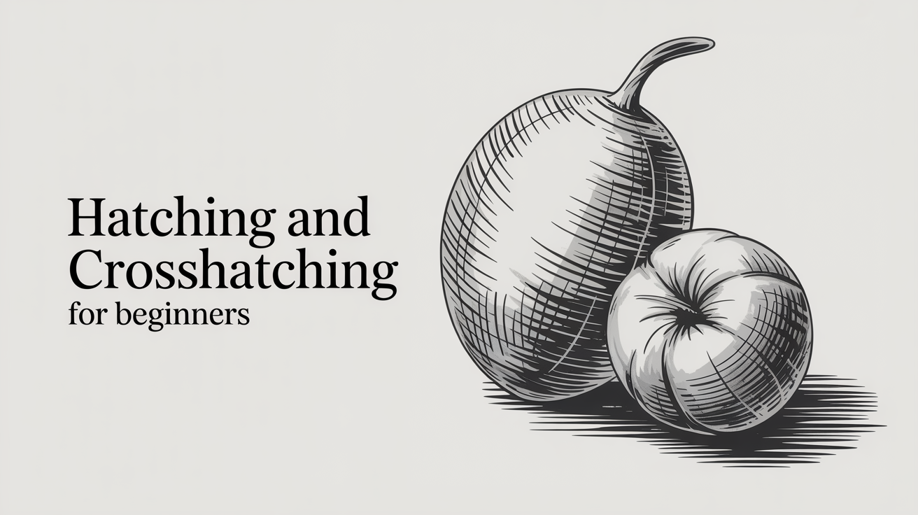
Hatching and Crosshatching for Beginners
Learn hatching and crosshatching to shade with a pencil. A step-by-step beginner guide covering value, line control, and simple practice drills.
Hatching means drawing a set of parallel lines close together to fill an area with tone. Crosshatching takes that one step further: you layer a second set of lines at an angle across the first, then add more sets if you need deeper shadow. Together, these two hatching techniques are some of the oldest shading tools in drawing, and they work on everything from quick pencil sketches to finished ink illustrations.
What Hatching Actually Looks Like
A hatch mark is just a line. The magic happens when you group dozens of them side by side. Where the lines are spaced far apart, the paper shows through and the area reads as light. Where they crowd together, less paper shows and the area reads as dark. That range from light to dark is called value (the relative lightness or darkness of a tone).
There are no rules about line angle, but most beginners find a 45-degree slant comfortable because it keeps the wrist moving freely across the page. Horizontal lines work well for flat planes like tabletops. Vertical lines can feel stiffer but suit some subjects.
The key point: you are not coloring in a shape. You are placing individual lines with intention, controlling their spacing to guide the viewer's eye toward light and shadow.
For a broader look at pencil shading fundamentals before going deeper into hatching, see How to Shade with a Pencil: A Beginner's Guide.
Adding a Second Layer: How to Crosshatch
Crosshatching shading is built on the same logic as hatching, with one addition: after your first set of lines dries (or after a moment with pencil), you draw a second set crossing the first at a different angle, usually somewhere between 30 and 90 degrees offset.
Each new layer of lines darkens the area further. You can build surprisingly rich, velvety darks this way, with no blending or smudging required.
A simple crosshatching value strip, step by step:
- Draw a rectangle about 8 cm wide and 2 cm tall. Divide it into five equal columns with light pencil marks.
- In every column, lay down a first layer of parallel hatching lines at 45 degrees, spaced about 2–3 mm apart. Keep pressure light and even.
- Skip the first column (your lightest value). In columns 2 through 5, add a second layer crossing the first at roughly 90 degrees, same spacing.
- Skip columns 1 and 2. In columns 3 through 5, add a third layer at about 45 degrees the other way (a diagonal cross).
- In columns 4 and 5 only, add a fourth layer, closer together than the previous ones.
- In the final column, fill any remaining gaps with short lines until the tone is nearly solid.
You now have a five-step value scale built entirely from line work. Compare it to a smooth-shaded version if you like, the effect is different, but the value range is the same. For more on reading and building value scales, see How to Draw a Value Scale and Why It Matters.
Controlling Value Without Pressing Harder
A common beginner habit is to press harder on the pencil to get a darker tone. This digs grooves into the paper and produces uneven, shiny marks. With hatching, you have cleaner options:
Ways to change value using hatching techniques:
- Line spacing. Move the lines closer together for darker values; spread them apart for lighter ones. This is the most reliable control.
- Number of layers. Each crosshatched layer adds depth without requiring more pressure.
- Line weight. A slightly heavier hand on one layer can add emphasis, but do this intentionally and sparingly.
- Line length. Shorter strokes feel lighter and airier. Long strokes that run the full width of a shadow feel more solid and weighted.
- Pencil grade. An HB or 2B works well for hatching. Softer grades (4B, 6B) produce darker marks with the same light pressure.
Practice adjusting spacing before reaching for a darker pencil. You will have far more control over subtle gradations that way.
Contour Hatching: Making Lines Follow the Form
Straight parallel lines are a fine starting point, but they can make a curved surface look flat. Contour hatching solves this by curving the lines to follow the shape of the object, the same way topographic lines on a map follow a hill.
Shade a sphere with straight horizontal lines and it reads as a cylinder. Shade it with lines that arc gently across its surface, and the form suddenly pops. The lines themselves communicate roundness before the viewer even processes the value.
Try contour hatching on a simple egg shape:
- Draw an oval.
- Pick a light source. Shade the side away from it.
- Instead of drawing straight lines, gently curve each hatch line to wrap around the egg's belly.
- Add a second contour-hatched layer at a slight angle to deepen the shadow.
The curve does not need to be dramatic. Even a slight arc makes a difference. This technique appears throughout the work of engravers and draftspeople, and once you notice it you will see it everywhere.
Common Mistakes and How to Fix Them
Lines that are uneven or wobbly. This is normal at first. Draw from the shoulder, not the wrist. Slower strokes give you more control; faster strokes can feel freer once your hand is warmed up. Both have their place.
Gaps and clumps. When your lines bunch up in one spot and leave a gap in another, the tone looks patchy. Slow down and watch the space between lines, not the lines themselves.
Layering too fast. If you add a second crosshatch layer before you have a consistent first layer, the result is muddy. Finish one layer all the way across a shape before adding the next.
Scratchy-looking marks. This usually means you are lifting the pencil abruptly at the end of each stroke. Try drawing off the edge of the paper, or taper the pressure gently as the stroke ends.
None of these are permanent problems. Neat hatching takes practice, and consistency improves quickly once you understand what to look for. A few focused sessions of deliberate line drills will do more good than pages of casual shading.
Practice Drills to Build the Skill
Drill 1: The spacing ladder. Fill a rectangle with hatching lines, spacing them as evenly as you can. Then do another rectangle where the spacing gradually tightens from left to right, creating a smooth value transition. Repeat until the gradient looks smooth rather than steppy.
Drill 2: The crosshatch grid. Draw a 3x3 grid of small squares. Fill each one with a different combination: one layer only, two layers at 90 degrees, two layers at 45 degrees, three layers, tight spacing, wide spacing. Get to know how each combination looks before you need it inside a real drawing.
Drill 3: The sphere. Draw a circle and shade it using contour hatching, aiming for a smooth transition from light (near the top-left) to dark (lower-right shadow). This single exercise covers value control, contour hatching, and line consistency at once. Redo it weekly and compare your results.
Drill 4: Copy a master's hatch. Find a Dürer woodcut, a Rembrandt etching, or a pen drawing by any draftsperson you admire. Zoom in on a patch of shadow and copy just that patch, matching the line angles and spacing as closely as you can. You will learn more about how crosshatching shading works from one focused copy than from hours of freehand experimenting.
If your longer-term goal is smooth, blended transitions rather than visible line work, you will still benefit from understanding hatching, it trains your eye to see value clearly. And when you want to compare the two approaches, How to Blend Pencil Shading Smoothly covers the smudging side of things.
Frequently Asked Questions
Do I need to use ink for hatching, or can I use pencil? Pencil works perfectly. Ink is traditional for hatching (especially in illustration and engraving) because the lines stay crisp, but pencil gives you the option to erase and rework. Many artists start with pencil hatching and switch to ink only when they want a more graphic, high-contrast result.
How many layers of crosshatching can I use? As many as you need to reach the value you want. Three or four layers typically produce quite deep shadow in pencil. After that, the texture of the paper becomes a limiting factor, the tooth fills up and additional layers stop adding much depth. If you need darker marks, try a softer pencil grade rather than more layers.
Why do my hatching lines look jagged and uneven? Uneven lines usually mean you are drawing from the wrist rather than the shoulder. Try anchoring your elbow on the table and moving your whole forearm to draw each line. It takes adjustment, but the strokes become much more consistent. Also make sure your pencil is reasonably sharp, a worn-down tip produces uneven line weight.
Does line angle matter? Not in terms of right or wrong, but it matters for visual consistency. Pick an angle that is comfortable for your hand and stick with it within a given layer. When your lines go in multiple random directions in a single layer, the area reads as texture rather than smooth tone.
Can I mix hatching with blended shading in the same drawing? Absolutely. Hatching and smooth blending are not competing methods. Many artists use blended shading for large mid-tone areas and reserve hatching for sharp shadow edges or textured surfaces. Experiment with both in the same piece and see what feels right for the subject.