Shading & Value
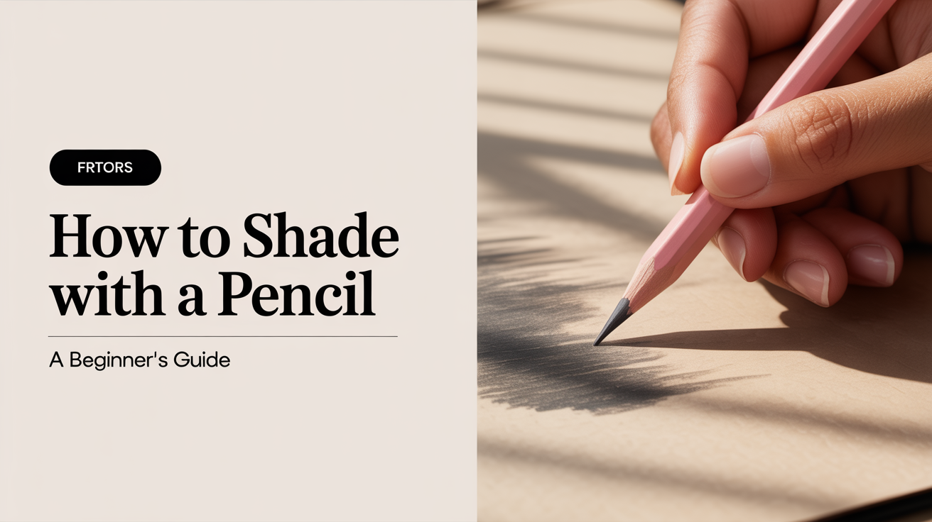
How to Shade With a Pencil: A Beginner's Guide
Learn how to shade with a pencil using smooth gradients, hatching, and blending. A practical beginner's guide with a simple sphere exercise.
Shading is what turns a flat outline into something that looks three-dimensional. If you've drawn a circle that still looks like a circle, learning how to shade with a pencil is the single skill that will change that most quickly. You don't need special tools to start, just a few pencils, some patience, and an understanding of a couple of core ideas.
What "Value" Means and Why It Matters
In drawing, value refers to how light or dark a tone is. It has nothing to do with color; a red apple and a green one can have identical values if they're equally bright. Value is what your eye reads when you squint at a scene and the colors disappear.
Every shaded drawing is really a map of values. The lightest areas (called highlights) are where light hits the surface most directly. The darkest areas (called core shadow or form shadow) are where light can't reach at all. Between those extremes sits a gradual transition called a gradient (or tone transition), and that smooth shift from light to dark is what convinces the viewer the surface is curved.
Getting comfortable with a full range of values, from pure white paper to a deep, dense black, is the foundation of all pencil shading for beginners. A value scale exercise is the best first drill: rule nine boxes and fill them in steps from lightest gray to darkest, and you'll immediately feel what pressure and pencil grade can do.
Pencil Grades and Pressure
Pencil grades are the first thing to understand before picking up a technique. The grading system runs from hard (H) to soft (B), with HB sitting in the middle:
- H pencils (2H, 4H, 6H) have a hard, fine core. They deposit very little graphite even with heavy pressure, so they're useful for pale highlights and construction lines.
- HB is the standard school pencil. It's versatile but neither extremely light nor extremely dark.
- B pencils (2B, 4B, 6B) have a softer, thicker core that deposits graphite generously. A 6B can reach a near-black tone with relatively light pressure and blends smoothly.
For most basic shading, a small set of three pencils covers almost everything: an HB for light tones and fine lines, a 2B or 4B for mid tones, and a 6B for deep shadows.
Pressure matters as much as grade. A 2B applied with almost no pressure gives a pale silver-gray. The same pencil pressed firmly gives a noticeably darker tone. The goal is to control that pressure consciously rather than letting your hand bear down by habit. Resting your hand lightly on the paper, moving from the wrist or elbow rather than the fingers, helps enormously.
A few practical habits:
- Keep your pencil point relatively sharp. A blunt tip deposits graphite unevenly and makes smooth gradients harder.
- Work in short, overlapping strokes, then build. Trying to reach a final dark tone in one pass usually produces streaks.
- Tilt the pencil slightly so the side of the lead touches the paper; this gives a softer mark than the very tip.
The Main Shading Techniques
There are several ways to apply graphite, and experienced artists mix them depending on the surface texture and mood they want. Here's a quick comparison before we dig into each:
| Technique | Best for | Key characteristic |
|---|---|---|
| Smooth blending (circulism) | Skin, fabric, soft forms | Tiny circular strokes merged together |
| Linear gradient | General gradients, large areas | Parallel strokes, pressure varies |
| Hatching | Edges, texture, loose styles | Parallel lines, spacing controls value |
| Crosshatching | Dense shadows, structured look | Two or more sets of lines crossing |
Smooth Gradient (Circulism)
This is pencil shading for beginners in its most forgiving form. Make tiny, overlapping oval or circular motions rather than back-and-forth lines, and gradually reduce pressure as you move toward the light. The circular motion eliminates the visible direction of the stroke, so the final result looks smooth.
To go darker, simply revisit an area with the same gentle circular motion, adding layers. Going lighter is harder (you can't remove graphite easily), so always start light and build.
Hatching
Hatching is a set of parallel lines drawn close together. The closer the lines, the darker the tone. As you move toward a lighter area, space the lines further apart and reduce pressure. Hatching has a directional quality that can suggest texture, wood grain, or fabric weave. Read more in our guide to hatching and crosshatching for beginners.
Crosshatching
Crosshatching adds a second (or third) layer of lines over the first, running at a different angle. This builds darker tones quickly and creates a textured, grid-like surface. It's traditional in ink drawing but works well in pencil too, especially for architectural subjects or when you want a deliberate, graphic feel.
Blending
Blending smooths existing graphite with a tool or your fingertip. A tortillon (rolled paper stump) or blending stump is the standard tool; a fingertip works in a pinch but adds skin oil. Blending works best on top of a gradient that's already roughly in place; it merges and softens edges rather than creating tone from nothing. For a full walkthrough of the process, see how to blend pencil shading smoothly.
A Simple Exercise: Shade a Sphere
A sphere is the classic shading exercise because it concentrates every value-related concept into one clean shape. Here's a step-by-step version you can complete in about 20 minutes.
-
Draw a circle. Trace a coin or bottle cap if you'd like a clean outline; freehand is fine too.
-
Decide where your light source is. Imagine a lamp to the upper left. Mark the highlight as a small oval in the upper-left quadrant of the circle. That spot stays as white paper throughout.
-
Block in a base tone. With an HB or 2B, apply light circular strokes across the whole sphere, skipping the highlight. Aim for a pale, even gray at this stage.
-
Identify the core shadow. The darkest band on a sphere sits opposite the light source, but not at the very edge. On your sphere, that means a slightly curved zone in the lower-right area. Build this up with a 4B or 6B, still using circular or linear strokes.
-
Transition from dark to light. Work outward from the core shadow toward the highlight, gradually reducing pressure. Blend the boundary between your mid-tone and shadow so there's no abrupt line. The gradient from shadow to light is what sells the curve.
-
Add a cast shadow beneath the sphere. The sphere sits on a surface, and it blocks light. Draw an ellipse below the sphere, darkest where it meets the sphere's base, fading as it extends outward. This grounds the shape and makes it look like it has weight.
-
Refine. Step back and squint at the drawing. Are there any sharp tonal jumps that shouldn't be there? Use a blending stump or a light circular stroke with a sharp HB to smooth them out. Deepen the darkest zones with a 6B if needed.
That's it. The sphere exercise isn't glamorous, but artists return to it because it covers value range, gradients, cast shadow, and highlight placement all at once.
Common Mistakes and How to Avoid Them
Pressing too hard too soon. Beginners often jump straight to heavy pressure trying to reach a dark tone in one pass. This compresses the paper's tooth (the tiny surface texture that holds graphite), making further layers nearly impossible. Always build from light to dark.
Outlining the shadow edge. Shading a shape by drawing a line around the shadow and filling it in flat produces a cartoon look. Shadows are gradients, not filled shapes. If you notice yourself drawing a boundary line for the shadow, erase it and replace it with a gradual tonal shift.
Ignoring the reflected light. The very edge of a sphere, on the shadow side, often picks up a faint reflected light from the surface underneath. It's subtle, but lifting that edge slightly (with an eraser or just reducing pressure there) adds convincing realism.
Skipping the cast shadow. A floating object with no cast shadow looks weightless and unfinished. Even a simple, small shadow beneath the object roots it in space.
Frequently Asked Questions
What pencil should I start with for shading? An HB and a 2B will cover most beginner shading needs. Add a 4B or 6B when you want richer darks. You don't need a full set of twelve grades to begin.
How do I get smooth, even shading without streaks? Use light pressure, small overlapping circular or oval strokes, and build tone in layers. A blending stump can help unify the surface afterward, but good technique with the pencil itself matters more than blending.
Is it better to shade with the side of the pencil or the tip? Both have uses. The side of the lead covers large areas quickly and gives a softer mark. The tip gives more control for edges, fine hatching, and precise dark accents. Most artists switch between the two within a single drawing.
How do I make my shading look three-dimensional? Pay close attention to where the light source is, and keep that consistent throughout the drawing. The highlight, mid-tone, core shadow, and reflected light all need to relate to the same imaginary light. Inconsistent lighting is the most common reason a shaded drawing still looks flat.
Can I erase pencil shading if I go too dark? Yes, though graphite that has been pressed hard into compressed paper is difficult to remove completely. A kneaded eraser (the soft, putty-like kind) lifts graphite gently without damaging the paper surface. You can also dab with it to lighten an area rather than rub, which preserves more paper texture.