Shading & Value
How to Draw a Value Scale (and Why It Matters)
Learn how to draw a value scale step by step and discover why this simple pencil exercise transforms your shading and makes drawings look three-dimensional.
Value is the lightness or darkness of a tone, completely separate from color. A red apple and a blue bowl can share the same value; a sheet of white paper and a shadow can differ by nine steps on a value scale. Mastering value is the single fastest way to make flat drawings look solid and real, and building a personal pencil value chart is how you learn to control it.
At a Glance
- Value means lightness versus darkness only, independent of color, and it is what makes a drawing read as three-dimensional.
- A five-step scale (white to near-black) is the right starting exercise; nine steps is the standard for finer control.
- Two or three pencil grades (hard, mid, soft) make the exercise more instructive than one grade alone.
- Boxes 2 and 3 near white, and boxes 4 and 5 near black, are where most beginners compress values together by mistake.
- Once you have a scale, hold it against your subject to identify the exact value of a shadow instead of guessing.
- Pressure and grade both control tone; combining them gives more range than either alone.
Why Value Matters More Than Line
Line is how most beginners think about drawing. But look at any convincing realistic sketch and you'll notice the lines are almost secondary. What sells the form is tone: a gradual shift from light through middle gray to deep shadow. That shift is called a gradient (sometimes called a tonal range), and your eye reads it as three-dimensional surface. Artists have relied on this trick for centuries: the technique of building volume through light-and-dark contrast, known as chiaroscuro, has been used to suggest solid form in drawing and painting since at least the Renaissance, and it works for exactly the same reason a pencil value scale does.
A value scale drawing trains your hand to hit specific tonal targets deliberately instead of accidentally. Once you can reliably produce a clean ten-step chart from paper-white to near-black, you stop fighting your pencil and start placing tones exactly where you need them.
If you haven't practiced the basic shading strokes yet, our beginner's guide to pencil shading covers those mechanics first and pairs well with the value scale exercise below.
What You'll Need
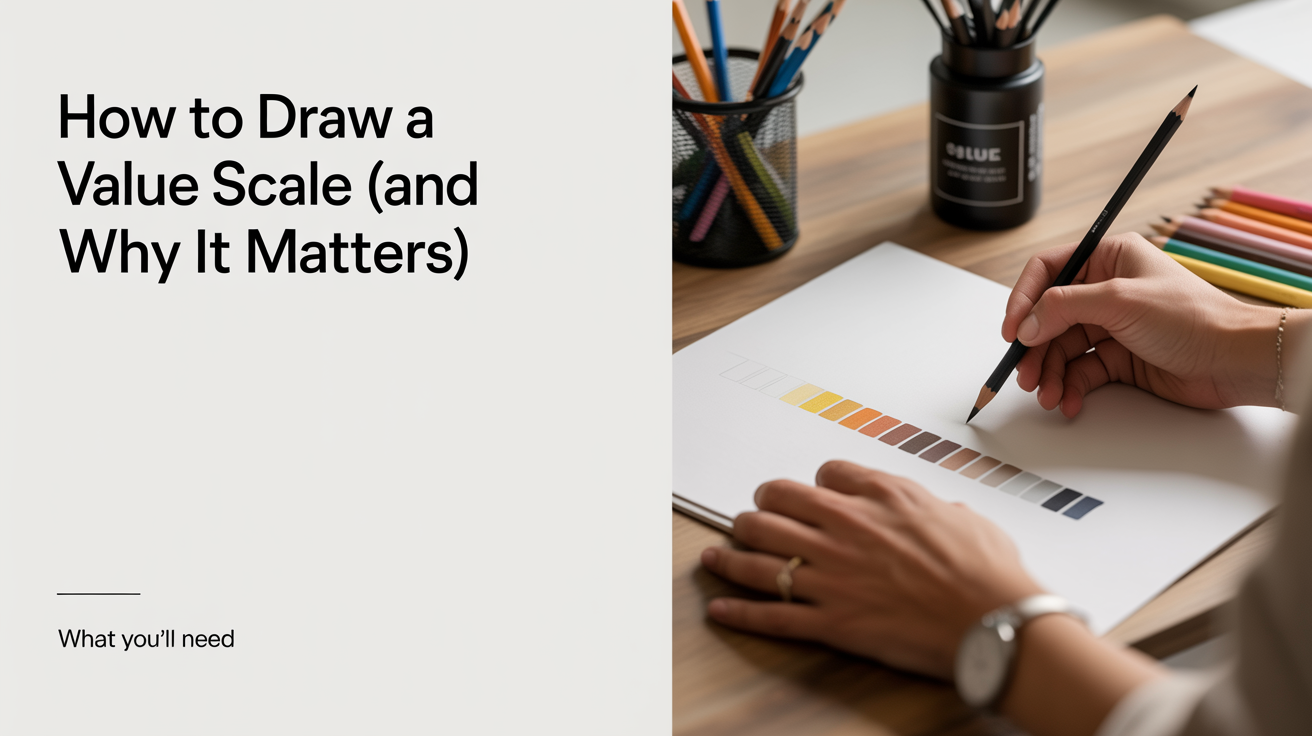
You don't need anything fancy. A few pencil grades make the exercise far more instructive than using a single pencil.
| Item | Why it helps |
|---|---|
| HB or 2H pencil | Pale end of the scale; resists going too dark |
| 2B or 4B pencil | Dark end; reaches deep shadow without heavy pressure |
| Smooth cartridge paper (70–90 gsm) | Consistent tooth; shows tonal differences clearly |
| Ruler and pencil for layout | Even boxes keep you honest |
| Blending stump or finger (optional) | Smooths stroke texture for a cleaner gradient |
A single HB can do the whole job through pressure variation alone. Using two or three grades, though, shows you how grade and pressure interact, which is genuinely useful information.
How to Draw a 5-Step Value Scale
A five-step scale is the right starting point. It forces you to think in clear jumps: white, light gray, middle gray, dark gray, near-black. Here are the steps:
- Draw a horizontal rectangle about 12 cm wide and 2.5 cm tall.
- Divide it into five equal boxes with a ruler and light pencil lines.
- Leave the first box completely untouched. That is value 1: pure paper white.
- In box 2, apply very light pressure with an HB, using smooth parallel strokes. Aim for a pale gray you could almost miss.
- In box 3 (middle value, also called a midtone), increase pressure or switch to a 2B and build an unmistakable medium gray.
- In box 4, deepen the tone further. You want this clearly darker than the midtone but not black.
- In box 5, press firmly with a 4B or 6B and fill the box as evenly as you can. This is your darkest achievable value.
- Step back and check the jumps. Each box should read as a distinct step. If boxes 2 and 3 look identical, darken box 3. If 4 and 5 blur together, go darker on 5.
Redo the scale two or three times. Most beginners find that boxes 4 and 5 compress into one smudgy dark mass on the first attempt. That's normal and fixable with practice.
How to Draw a 9-Step Value Scale
Nine steps is the standard for a professional tonal value scale exercise, and it maps closely onto the Munsell value scale used in formal color theory, where value 0 is pure black and value 10 is pure white. The logic here is identical to the five-step version, but the gaps between tones are smaller, which demands finer control.
- Draw a rectangle roughly 22 cm wide and 2.5 cm tall.
- Divide into nine equal boxes.
- Box 1: untouched paper (value 1).
- Boxes 2 and 3: use a 2H or H with light, then slightly heavier pressure. These are the delicate "light" zone where most beginners rush.
- Box 4: transition into the light-to-midtone range with an HB.
- Box 5: true midtone. This is the visual center of your scale. It should look equally removed from both white and black.
- Box 6: switch to a 2B and build a tone noticeably deeper than the midtone.
- Boxes 7 and 8: press harder or switch to a 4B. The jumps here feel dramatic on paper but subtle on the finished scale.
- Box 9: fill with a 6B or 8B using firm, layered strokes. Burnish slightly with the side of your finger if the surface still looks streaky.
The hardest part of the nine-step scale is the light end (boxes 2 and 3). Most people make them too similar to box 1 or to each other. Spend extra time there. A useful check: squint at the finished scale from about a meter away. If two adjacent boxes vanish into each other when you squint, the jump between them is too small and needs redoing.
Pressure vs Grade: Which Controls the Tone?
Both levers work. Pressure alone on a single HB can move you from a whisper-light tone to a fairly convincing dark, though you'll never reach a true deep black without a softer grade. Grade alone (leaving pressure constant) lets you change tonal range without retraining your hand pressure.
In practice, most pencil value charts use a combination: hard grades (H, 2H) for the light values, medium grades (HB, B) for the midtones, and soft grades (2B, 4B, 6B) for the darks. This approach prevents the paper tooth from clogging too early and gives you more room to layer.
If you'd like to explore how individual stroke patterns affect tone and texture, hatching and crosshatching for beginners explains how to build value with directional lines rather than smooth shading.
Using Your Scale When Drawing from Life
The real payoff of building a tonal value scale is that you now have a reference. Hold it up next to your subject and ask: what value is that shadow on the side of the mug? If it matches box 7 on your nine-step scale, you know exactly how dark to go on the page.
This is called "reading values," and it's a skill that sidesteps guesswork entirely. When you squint at a subject, colors tend to disappear and tones become clearer. Squinting is a legitimate technique, not a workaround.
A few practical habits once your scale is made:
- Pin or tape the scale to the corner of your drawing board so it's visible while you work.
- When a shadow looks "dark," pin down whether it's a 6, 7, or 8. Being specific prevents the common mistake of making all shadows the same tone.
- Use a small piece of white paper as a value key: hold it next to different parts of your subject to see how much lighter the paper is than each area.
- Photograph your subject and convert the photo to grayscale on your phone. It strips out color entirely and makes value differences much easier to read while you're still learning.
Once you can blend transitions smoothly between the tonal steps, blending pencil shading smoothly shows techniques for eliminating visible stroke texture when you need a clean gradient.
Common Mistakes to Watch For
A few habits show up again and again in early value scales:
- Skipping straight to nine steps. Without first nailing the five-step version, the extra boxes just multiply the same errors. Master five clean, distinct jumps before adding more.
- Changing pencils mid-box. Switching grade or pressure partway through filling a single box leaves a visible seam. Commit to one approach per box, then move on.
- Working too small. A value scale drawn at 5 cm wide gives you almost no room to build up even, layered tone. Give each box at least 2 cm in every dimension so pressure differences actually register.
- Forgetting the paper itself is value 1. Beginners sometimes lightly shade the "white" box out of habit. Leave it completely untouched; the whole scale is calibrated against true paper white.
Frequently Asked Questions
How many steps should a value scale have? Five steps is a fine starting point; nine steps is the standard most drawing courses use. Some artists work with as many as eleven steps for very detailed realism, but the difference between nine and eleven is subtle. Build the five-step version until the jumps look even, then move to nine.
Can I draw a value scale with just one pencil? Yes. A single 2B pencil can cover most of the range through pressure variation alone. The lightest values will be harder to control (a 2B goes darker faster), so an HB or 2H is more comfortable for the pale end. But starting with one pencil is perfectly reasonable.
Why does my dark end look streaky? Streaks usually mean the paper tooth is still showing through the graphite. Try layering two or three light passes instead of one heavy pass, and lightly blend with a stump or your finger between layers. A very soft grade (6B or 8B) also fills the tooth faster.
How long should I practice the value scale before moving on? There is no fixed timetable, but a good benchmark is producing a nine-step scale where each box is clearly distinct and the jumps look roughly even to a fresh eye. That typically takes four to ten practice scales spread across a few sessions. Don't rush it; the control you build here carries into every shaded drawing you do afterward.
Does a value scale work the same way with charcoal or ink? The concept is identical, though the tools behave differently. Charcoal covers value range very fast (it's easy to go dark) and blends effortlessly. Ink wash works in dilution ratios rather than pressure. The tonal value scale exercise translates to any medium; building one in your medium of choice is always worth the time.
Should the boxes in my value scale be perfectly even steps, or can I judge by eye? Judging by eye is fine and is actually the point of the exercise. A true printed or digital value scale divides the range into mathematically equal steps, but your hand-drawn version only needs each box to read as clearly distinct from its neighbors. Consistency across the whole scale matters more than mathematical precision.