Shading & Value
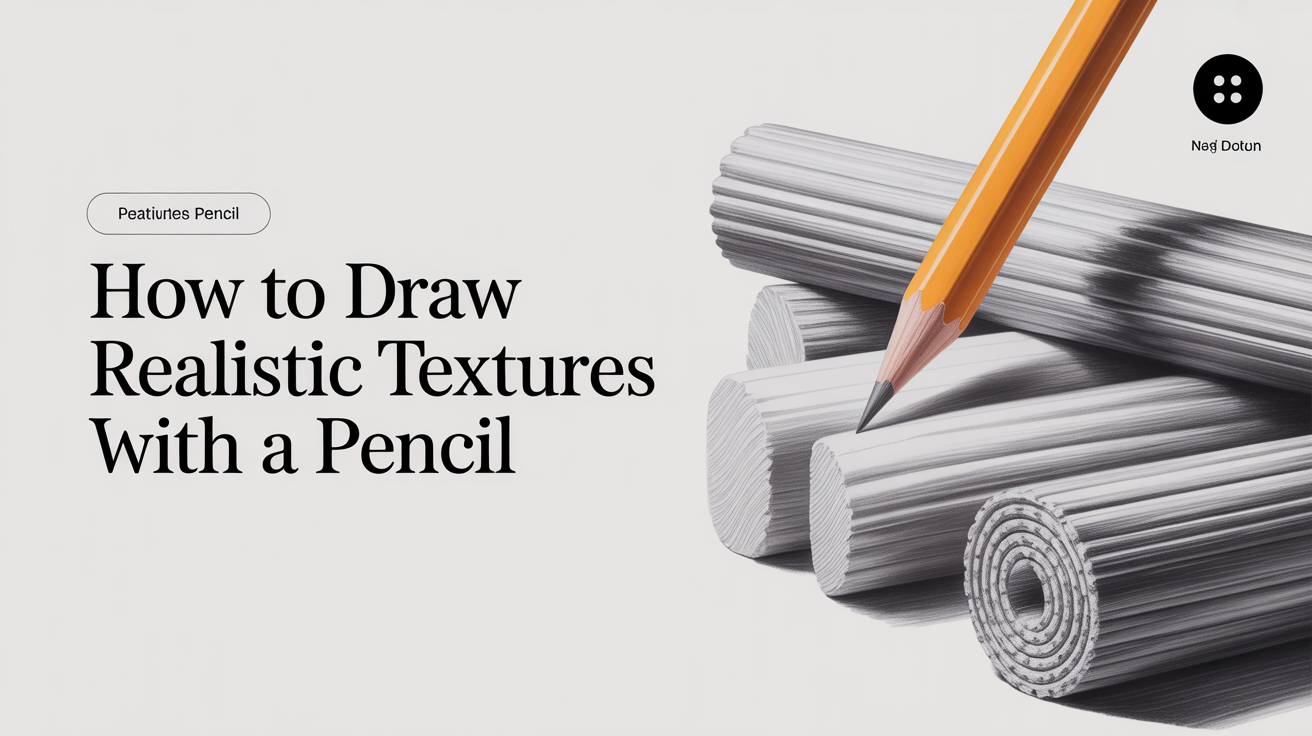
How to Draw Realistic Textures With a Pencil
Learn how to draw realistic textures with a pencil. Step-by-step techniques for wood grain, metal, glass, fur, and more for beginner artists.
Texture is one of those things that separates a drawing that looks flat from one that looks touchable. When you suggest the roughness of bark, the cold smoothness of glass, or the soft grain of wood, your drawing stops looking like a picture of something and starts feeling like the thing itself.
The good news: you do not need fancy supplies or advanced skills to start. Most texture techniques come down to controlling three variables: pencil grade (how hard or soft the lead is), paper tooth (how rough the surface is), and pressure. Once you understand those three levers, you can render almost any surface convincingly.
Understanding Paper Tooth and Pencil Grades
Before you draw a single mark, your materials already shape what textures are possible.
Paper tooth is the texture of the paper surface itself. A rougher paper (higher tooth) grabs more graphite, which helps with organic textures like wood, stone, and fabric. Smoother paper lets you blend more evenly, which suits glass, metal, and skin. A mid-grade paper around 60-90 lb cartridge or sketching paper is a good starting place for most texture work.
Pencil grades run from 9H (very hard, light mark) to 9B (very soft, dark mark). For texture drawing:
- H pencils (2H, H): Light marks, precise detail, good for fine grain lines and initial light layers
- HB: A reliable all-rounder, useful for mid-tones
- B pencils (2B, 4B, 6B): Darker, softer, ideal for deep shadows and soft textures like fur or velvet
A simple starting kit: a 2H, an HB, a 2B, and a 4B covers nearly every texture you will encounter as a beginner.
Core Pencil Texture Techniques
These four methods are the foundation of most texture drawing. You will mix them depending on what surface you are rendering.
Hatching means drawing a series of parallel lines close together. The lines do not cross. Use hatching to build up tone gradually on harder surfaces like wood or stone. The direction of your lines can suggest grain or surface flow.
Crosshatching adds a second layer of lines over the first, running at an angle (usually 45-90 degrees). Each new layer darkens the value (how light or dark an area appears) without creating muddy smearing. This is especially useful on metal and fabric where tonal transitions need to stay crisp.
Stippling uses dots rather than lines. Dense dots read as dark; sparse dots read as light. Stippling is slower but gives a controlled, organic result that works well for rough stone or aged leather.
Burnishing means pressing hard with a soft pencil (4B or 6B) or a blending stump to flatten the graphite into the paper tooth. This removes the visible grain of the paper and creates a smooth, polished look. Essential for glass and reflective metal. The trade-off: once you burnish an area, it resists new layers of graphite, so burnish last.
For a deeper look at building values through these mark-making methods, see the guide to hatching and crosshatching for beginners.
How to Draw Common Textures: Wood, Metal, and Glass
Wood Grain
Wood grain is one of the most beginner-friendly textures because slight irregularity actually looks more realistic, not less.
- Start with a light base layer using a 2H pencil, shading smoothly across the whole area.
- With a sharpened HB, draw long, flowing lines that follow the direction of the grain. Vary their spacing slightly and let some lines curve gently or split.
- Add knot rings by drawing tight oval lines in one area, then radiating grain lines outward from that oval.
- Darken the spaces between grain lines with a 2B, keeping the pencil parallel to the grain direction.
- Soften transitions by blending lightly along the grain (not across it) with a tortillon or blending stump.
The key is keeping line direction consistent. Wood grain lines rarely cross each other.
Metal
Metal has high contrast and sharp value transitions. Matte metal (like iron or brushed steel) shows softer gradients; polished metal shows near-white highlights sitting right next to near-black darks.
- Map out your light source and decide which surfaces face it directly.
- Build mid-tones with crosshatching using a 2B, keeping strokes tight and even.
- Darken shadows with a 4B. On polished metal, make these transitions abrupt rather than gradual.
- Leave highlights as bare paper or erase them back with a kneaded eraser (a soft, moldable eraser you can shape into a fine tip).
- Burnish the lightest highlight areas with a 4B or a colorless blender to create a hard-edged shine.
Glass
Glass transmits and reflects light at the same time, which means you are actually drawing reflections, not the glass itself.
- Start by identifying what is reflected or visible through the glass and sketch those shapes lightly.
- Use a 2H to build a pale layer over areas that are behind the glass (objects seen through it tend to look slightly lighter and less sharp).
- Add reflections with darker, crisper marks using a 2B. Reflections on glass often have hard edges.
- Leave some areas completely white (bare paper). These are the strongest highlights.
- Burnish along the brightest reflected lines.
The main mistake beginners make with glass is shading it like a solid object. Focus instead on the contrast between the very dark (deep reflections) and the very light (open sky reflections or light sources), with the middle tones playing a supporting role.
Understanding how value shifts across a surface is central to all texture work. The guide on how to shade with a pencil covers this in more detail.
Texture Reference Cheat Sheet
| Surface | Pencil Grades | Key Technique | Paper Choice |
|---|---|---|---|
| Rough wood | HB, 2B, 4B | Hatching along grain | Medium tooth |
| Smooth metal | 2H, HB, 4B | Crosshatching + burnish | Smooth |
| Glass | 2H, 2B, 4B | Hard-edged contrast | Smooth |
| Fabric/cloth | HB, 2B | Soft crosshatching + blend | Medium tooth |
| Stone/brick | HB, 2B, 4B | Stippling + irregular hatching | Rough or medium tooth |
| Fur/hair | 2B, 4B | Short directional strokes | Medium tooth |
| Skin | 2H, HB | Light crosshatching + blend | Smooth or medium |
Building a Practice Habit for Texture
One of the most effective things you can do is keep a texture study page in your sketchbook. Fill small squares with different surface types, labeling the pencils and techniques you used. This becomes a personal reference library.
Do not aim for perfection on a first pass. A shaky line in a wood grain drawing often just reads as natural variation. The goal at the start is to build a sense of how each mark behaves on your specific paper, because paper and pencil combinations vary enough that experience on your materials matters more than any formula.
Running a value scale from 1 (white) to 10 (darkest black) before each texture study helps you see how much range you have to work with. The guide on how to draw a value scale and why it matters walks through that exercise step by step.
Frequently Asked Questions
What pencil is best for drawing textures? There is no single best pencil. Hard pencils (2H, H) suit fine line work and light initial layers. Soft pencils (2B, 4B) handle deep shadows and burnished highlights. Most texture drawings use at least two or three grades, switching as you move from light areas to dark ones.
How do I make my pencil drawings look less flat? Flat drawings usually have a limited value range, meaning the lightest lights and darkest darks are too similar in tone. Try pushing your darkest shadows darker with a 4B or 6B, and use a kneaded eraser to pull highlights back toward white. Higher contrast alone makes most drawings read as more three-dimensional.
Do I need special paper for texture drawing? Not at all. Standard 60-90 lb sketching paper handles most pencil texture work well. Smooth Bristol or hot-press watercolor paper is worth trying if you want to draw reflective surfaces like glass or polished metal, since it gives you cleaner burnished highlights.
How long does it take to get good at drawing textures? That depends on how often you practice and which textures you focus on. Most beginners notice real improvement after a few dedicated study sessions on a single surface type. Wood grain and fabric are generally easier starting points; glass and polished metal take longer because they require more confidence with high contrast and sharp edges.
Why do my textures look muddy when I blend? Blending smears existing graphite, which can fill in the paper tooth and leave a gray smear rather than a smooth gradient. This usually happens when there is too much graphite on the paper before blending, or when you blend too hard. Try using a lighter touch and less graphite in early layers, then blend gently. If an area has gone muddy, a kneaded eraser can lift some graphite and restore a little contrast.