Subjects & Projects
How to Draw Eyes That Look Real
Learn how to draw eyes that look real with this beginner step-by-step guide covering anatomy, shading, iris detail, and eyelashes.
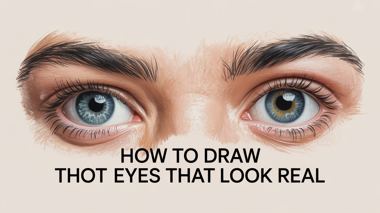
Drawing eyes convincingly trips up more beginners than almost any other subject. The good news is that most of the trouble comes from one misunderstanding, and once you fix it, everything else clicks into place.
The Insight That Changes Everything: The Eye Is a Sphere
Before a single pencil line, get this into your head: the eyeball is a sphere sitting inside a bony socket. The eyelids don't float flat on a face; they wrap around that sphere. This is the single biggest reason beginner eyes look flat or cartoon-like. Once you draw lids as fabric draped over a ball, the whole eye gains weight and depth.
A few anatomy terms worth knowing:
- Sclera, the white of the eye. It isn't actually white; it picks up ambient shadow and often looks light grey or even faintly warm.
- Iris, the colored ring around the pupil. It's a disc-shaped structure, so when the eye looks straight at you, it appears as a near-circle. In side view, it flattens into an ellipse.
- Pupil, the dark opening at the center of the iris. It expands in dim light and contracts in bright light.
- Catchlight (also called a highlight), the small bright reflection of a light source on the cornea. It's tiny, but it's what makes an eye look wet and alive. Kill the catchlight and the eye looks dead.
- Tear duct (lacrimal caruncle), the small pink fleshy bump at the inner corner. Beginners almost always skip it, which makes the inner corner look cut off.
Also worth noting: the upper lid casts a shadow across the top of the iris because it protrudes forward over the eyeball. That thin strip of shadow is easy to add and immediately reads as realistic.
How to Draw an Eye Step by Step
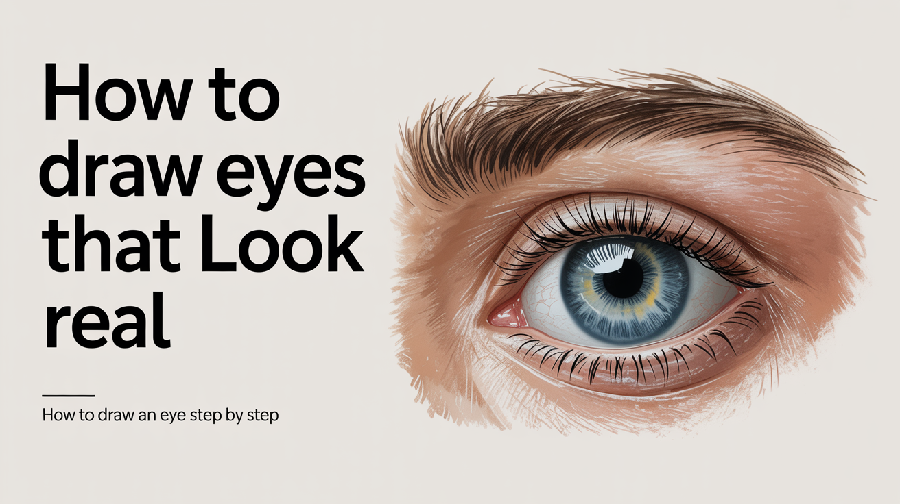
Work through these steps on smooth or medium-grain paper with a range of pencils, an HB for initial lines, a 2B or 4B for mid-tones, and a 6B for the darkest darks. A kneaded eraser is your best tool for lifting highlights.
-
Sketch the basic almond shape. The eye isn't a perfect almond; the inner corner dips slightly lower than the outer corner in most faces. Draw a light almond, then adjust so the inner point curves down into a small rounded bump (the tear duct area). Keep lines very light at this stage.
-
Place the iris. The iris is partially hidden under the upper lid. Draw a full circle for the iris first, then erase or simply don't draw the part the lid covers. The bottom of the iris usually just touches or barely dips below the lower lid. Centered irides look surprised; slightly covered tops look natural.
-
Add the pupil. Place a smaller circle inside the iris, perfectly centered. Keep it dark but leave a small white dot where the catchlight will live. The catchlight typically sits at roughly the ten or two o'clock position, depending on your light source.
-
Define lid thickness. This is where beginners almost always lose realism. The upper lid has visible thickness (like the edge of a cardboard lid), not just a line. Draw a second line just inside and above your original upper lid line to show that edge. Do the same, more subtly, on the lower lid.
-
Block in the shadow under the upper lid. Using a 2B, lay a soft gradient shadow across the top of the iris and sclera directly under the upper lid. This alone jumps the eye forward in realism.
-
Shade the sclera. It isn't white. Add very light tone (barely touching the paper with an HB) to the corners and edges of the sclera. Leave the center closest to the iris the lightest.
-
Work the iris. The iris has radiating fibrous lines from the pupil outward, plus a darker rim at its outer edge (the collarette). Use short, slightly curved strokes radiating from the pupil. Don't make them perfectly uniform, vary pressure and length. Add a slightly darker ring around the outer edge of the iris.
-
Deepen the pupil. Push the pupil to near-black with a 6B. Leave the catchlight white. If you've accidentally filled it in, lift it with the tip of a kneaded eraser.
-
Add the tear duct. At the inner corner, sketch a small rounded shape with faint pinkish-grey tone (light pencil pressure, slightly warm if you have toned paper or coloured pencil). It grounds the inner corner.
-
Draw the eyelashes. See the next section for this specifically, it's easy to ruin the eye at this step.
For more on placing the eye correctly on the face, this face-proportions guide walks through the standard measurements that keep features from drifting.
Getting the Iris, Pupil, and Catchlight Right
The iris is often the most tempting place to overwork. Beginners tend to scribble it uniformly dark, which makes it look flat and muddy.
Think of the iris in three zones: a dark outer ring, a medium middle band, and the radiating pattern closest to the pupil. Leave the zone nearest the catchlight slightly lighter than the opposite side, light falls on the cornea unevenly, and that subtle variation makes the iris look round and glossy.
The catchlight needs to be placed consistently with your light source. If the light is upper-left, the catchlight goes at roughly ten or eleven o'clock on the eye. Both eyes in a portrait need their catchlights in the same position relative to the light, mismatched catchlights read immediately as "off" even to viewers who can't name why.
The pupil should be your darkest value in the whole drawing. If the pupil isn't darker than your darkest shadow, the eye won't read as luminous.
Shading for a Wet, Three-Dimensional Look
The "wet" look comes from value contrast and surface reflection, not from any special technique. A few specific moves create it:
The cornea (the clear dome over the iris and pupil) bulges slightly forward. This means the edge of the iris closest to the viewer is in very slight relief. If you add a barely visible crescent of lighter tone along the bottom edge of the iris, it implies that curve.
Blend the sclera shading smoothly, any grain or stroke texture here breaks the illusion of a smooth moist surface. A tortillon or a fingertip lightly dragged across the sclera area works well.
The fold of the upper eyelid, and any skin above the eye socket, gets progressively darker toward the brow. Keep those values smooth and use softer grades (2B, 4B) blended with a stump. Sharp edges in the skin around the eye look wrong; edges in the eye itself (lid margins, iris edge) should be crisper.
Adding Eyelashes Without Wrecking the Drawing
Eyelashes are the most commonly botched final step. Beginners either draw them as a uniform row of identical lines, or press too hard and get heavy black bars instead of hairs.
Lashes grow in overlapping rows, not a single tidy line. They curve outward and slightly away from the eye, growing longer toward the outer corner and shorter toward the inner corner. The upper lashes are significantly longer and denser than the lower lashes.
Draw each lash as a single tapered stroke: press slightly at the root (where it emerges from the lid margin), then lift the pencil as you curve outward so the stroke thins to a point. Vary the curve direction slightly between lashes, real lashes clump and cross. A 4B or 6B works well here.
Lower lashes are shorter, sparser, and more horizontal. Draw them with much lighter pressure than the upper ones.
One rule that helps: draw lashes last, over the finished shading, and don't outline the lid margin before the lashes. If you draw a heavy dark line along the lid first and then add lashes on top, the lid looks outlined rather than fringed.
Common Mistakes to Avoid
- Making the eye too symmetrical. Real eyes have subtle asymmetry between the inner and outer corners, and between the upper and lower lid curve.
- Coloring the sclera pure white. Leave it for paper texture or add light tone; a stark white sclera looks like a cartoon.
- Forgetting the upper-lid shadow on the iris. Without it, the eye reads as a sticker on a face.
- Drawing lashes as a silhouette outline. Lashes are individual hairs, not a fringe border.
- Omitting the tear duct. Skipping it leaves the inner corner looking like the eye was cropped.
- Filling in the catchlight. This is the most common single mistake. If it's gone, lift it back with a kneaded eraser before anything else.
- Overworking the iris. More texture doesn't always mean more realism. Let some areas breathe.
If you want to apply these same shading and value principles to a full portrait, the beginner figure-drawing guide covers how anatomical understanding transfers across the whole body.
Frequently Asked Questions
Why do my drawn eyes always look flat? Usually it's because the lids are being drawn as flat lines rather than as fabric wrapping a sphere. Go back to step one and sketch the full eyeball circle first, then place the lids over it. The difference is immediate.
How do I make the eye look shiny or wet? Three things together create that look: a sharp, bright catchlight left completely white; a dark pupil (the contrast is what makes the highlight "pop"); and smooth blending on the sclera with no visible texture or stroke marks.
Should I draw both eyes at the same time? For portraits, yes. Switching between both eyes frequently helps you catch proportion errors and keep the catchlights consistent. Drawing one eye to full finish before starting the other often leads to mismatched sizes or levels.
How dark should the pupil be? As dark as your darkest pencil grade allows. If you're using graphite, a 6B or 8B pushed firmly will get you close to black. The pupil should be the single darkest mark in the eye, darker than the lash roots or any shadow.
My eyelashes look stiff and uniform. How do I fix that? Work on varying the curve and length of each stroke. Real lashes clump into small groups of two or three, so try drawing a pair of lashes that start from the same point at the lid and splay apart as they grow. Also vary your pencil pressure within each stroke: heavier at the base, almost lifting off at the tip.
For hands (which pair with portrait work more often than you'd think), this guide to drawing hands covers the same sphere-and-wrapping principle applied to knuckles and joints.