Perspective & Composition
How to Create Depth and Distance in a Drawing
Learn how to create depth in a drawing using overlapping, scale, atmospheric perspective, and value. Practical techniques for beginners.
A flat drawing looks like a shape cut from paper and pasted onto the page. A drawing with depth feels like a window into a real space, where some things sit close enough to touch and others fade into the distance. Getting from one to the other does not require any special talent; it comes from understanding a handful of concrete techniques and applying them with patience.
This guide covers the main tools for drawing depth and distance, starting with the simplest and building toward the more nuanced. Work through them one at a time before combining them.
Overlapping: The Quickest Way to Show What Is in Front
Overlapping means drawing one object so that it partially covers another. The object doing the covering automatically reads as closer to the viewer. This works even when both shapes are exactly the same size, because the eye interprets the interrupted outline as evidence of distance.
Try this with a basic exercise:
- Draw three circles of identical size scattered across your page.
- Let two of them overlap slightly, so one circle's edge cuts across another.
- Notice how immediately the overlapping circle reads as the nearest one.
Now apply the same logic to a row of trees, a stack of books, or figures in a crowd. Overlapping costs nothing in effort but pays off enormously in spatial clarity.
Scale: Smaller Means Farther Away
Objects of the same real-world size appear smaller as they move away from the viewer. This is one of the most reliable cues the eye uses to read distance.
When you draw a road lined with telephone poles, the poles near the bottom of the page should be tall. The ones further up the page should shrink gradually. The same logic applies to figures, windows, fence posts, and almost any repeated object. Even when you are drawing from imagination rather than observation, deliberately making background elements smaller than foreground ones gives the scene a sense of space.
A practical way to check your scale relationships: hold your pencil horizontally across the drawing and compare the heights of objects at different depths. If the background figures are the same height as the foreground figures, the distance will not read convincingly.
For a deeper look at how scale and diminishing size connect to formal perspective rules, see one-point perspective for beginners.
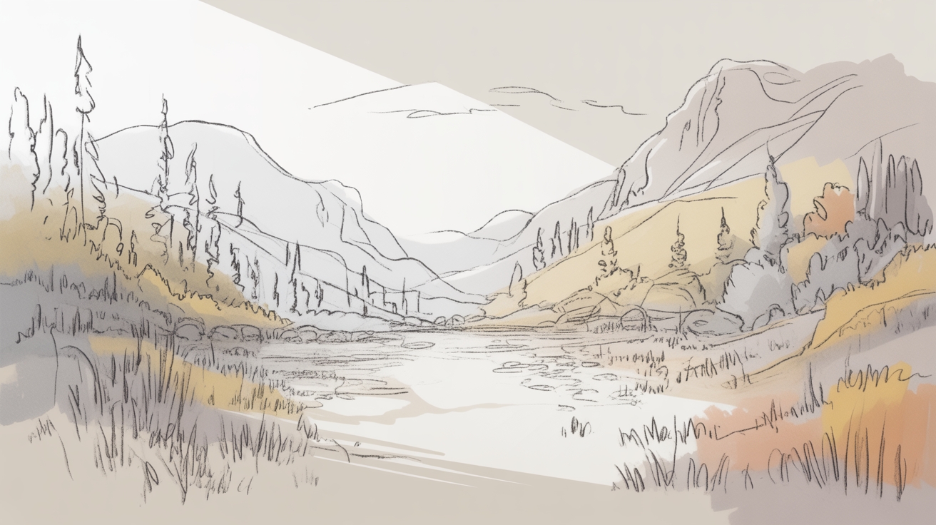
Atmospheric Perspective: How Distance Changes Value and Contrast
Atmospheric perspective (sometimes called aerial perspective) is the effect that air has on how we see distant objects. Dust, moisture, and tiny particles in the atmosphere scatter light, which means that things far away appear:
- lighter in value (closer to the mid-grey or white of the sky)
- lower in contrast (shadows become less dark, highlights less bright)
- less sharp in edge quality
- slightly cooler or bluer in tone (relevant for color work, less so for graphite)
In a graphite or charcoal drawing, you translate this into value control. Value refers to how light or dark a mark is on a scale from white to black.
Here is a straightforward way to practice making backgrounds recede using atmospheric perspective:
- Sketch a simple landscape with three loose zones: a foreground, a middle ground, and a background hill or treeline.
- In the foreground, use your full range of pencil pressure. Push hard for dark shadows and lift lightly for bright areas. Keep your edges crisp.
- In the middle ground, reduce contrast. Make shadows a medium grey rather than near-black. Soften edges slightly by blending with a fingertip or tissue.
- In the background, use only light pressure. The darkest mark in your background should be no darker than a mid-grey. Blur edges further. Leave sky areas almost untouched.
When you step back and look at the result, the background should feel farther away than the foreground, not because of any perspective lines, but because the eye reads low-contrast, soft-edged forms as distant.
This technique is especially useful for landscapes, cityscapes seen from a distance, and any scene where the background extends toward a horizon.
The Horizon Line: Anchoring Your Depth
Every outdoor scene, and many indoor ones, has a horizon line. In drawing, the horizon line (also called the eye level) is the imaginary horizontal line at the viewer's eye height. Objects above the horizon line are seen from below; objects below it are seen from above.
Placing the horizon line deliberately controls how the viewer feels inside the scene. A low horizon (near the bottom of the page) gives a sense of standing in an open space looking at a wide sky. A high horizon (near the top) lets you show a lot of ground and suits maps, bird's-eye views, and interior floors.
Getting the horizon line right before you start drawing prevents the most common depth problems in beginner work, where the ground plane tips up awkwardly or the sky looks disconnected from the land.
For a full explanation of how the horizon line works with vanishing points, see the horizon line and vanishing points made simple.
Placement on the Page: Higher Means Farther
In most drawings that show a ground plane, objects placed higher on the page read as farther away. This is because we are looking at a surface that extends away from us: things near our feet appear low in our visual field, while things in the distance rise toward the horizon.
This cue is subtle but powerful. Two objects of identical size, one placed at the bottom of the page and one placed near the middle, will read as the lower one being closer, even without overlapping or scale change.
Use page placement in combination with scale: the farther-back object is both higher on the page and smaller than the closer one. Together, the two cues reinforce each other and the depth reads clearly.
Combining the Techniques
None of these methods works in isolation as powerfully as when you layer several of them. A foreground rock that overlaps a middle-ground shrub, which is larger than a smaller, lighter, softer background treeline, placed appropriately on the page, creates convincing depth through four separate cues working together.
Start simple: pick one subject, like a row of trees or a path leading away from you, and apply overlapping, scale change, and atmospheric perspective at the same time. For more complex scenes involving buildings or interiors, adding proper perspective construction will extend what these simpler cues can do. See two-point perspective explained simply for a step-by-step introduction to that method.
Be patient with yourself as you build these habits. Experienced artists apply depth cues almost automatically, but that fluency is built through deliberate repetition, not talent. A few focused practice sessions go a long way.
Frequently Asked Questions
What is the difference between linear perspective and atmospheric perspective?
Linear perspective uses vanishing points and converging lines to show how parallel edges recede into the distance. Atmospheric perspective uses changes in value, contrast, and edge sharpness to show how the air between you and a distant object affects how it looks. Both are useful; they work on different aspects of the depth problem and can be used together.
Do I need to understand formal perspective rules to create depth?
Not at the start. Overlapping, scale, page placement, and atmospheric perspective are all intuitive techniques that work without any knowledge of vanishing points. Formal perspective becomes more important when you are drawing architecture, interiors, or any scene with strong straight edges that converge in the distance.
Why does my background still look flat even when I draw it smaller?
Scale alone often is not enough. Check whether your background elements also have lower contrast and softer edges than your foreground. If your background has the same dark shadows and crisp outlines as your foreground, it will compete visually rather than recede. Try lightening all your background marks significantly and blending the edges.
How dark should my darkest background mark be?
A useful rule of thumb: the darkest mark in your background should be no darker than a medium grey, roughly a 4B pencil at light pressure or a 2B at moderate pressure. Your foreground can go as dark as 6B or 8B. That contrast gap between zones is what makes the distance read.
Can these techniques work for portrait or figure drawings, not just landscapes?
Overlapping and scale are directly useful in figure drawing and multi-figure compositions. Atmospheric perspective is less common in close-up portraiture but can be used in scenes where a figure stands in front of a landscape or a room interior, to push the background back and make the figure stand out.