Perspective & Composition
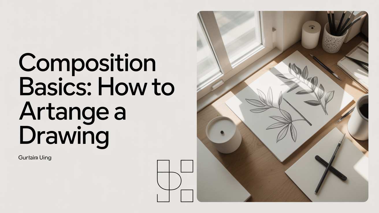
Composition Basics: How to Arrange a Drawing
Learn drawing composition basics with this beginner guide: rule of thirds, visual weight, negative space, and how to arrange a drawing with confidence.
Every drawing decision you make after picking up a pencil is a composition choice. Where do you put the main subject? How much space should surround it? Why does one sketch feel balanced while another looks crowded or empty? These questions all belong to composition, which is simply the arrangement of shapes, lines, and spaces within your picture area. Getting a handle on a few key ideas early on will save you from the frustration of finishing a drawing only to feel that something is off without knowing why.
What Composition Actually Means
Composition is the practice of deciding where things go on the page and why. A well-composed drawing guides a viewer's eye through the picture in a deliberate order. A poorly composed one can leave the viewer's eye wandering or landing immediately on the border and sliding off.
You do not need to follow rigid formulas to compose well, but knowing a handful of principles gives you a vocabulary for the choices you are already making by instinct. Once you can name what you are doing, you can also choose to break a rule on purpose rather than stumbling into a mistake by accident.
The picture plane is the term for the flat rectangle or square you are drawing on. Everything you place inside it either helps or competes with your main subject. Thinking of the page as an active area rather than blank paper you fill in is a useful mental shift.
The Rule of Thirds and Where to Place Your Subject
The rule of thirds is one of the most widely taught art composition rules, and for good reason: it works. The idea is straightforward. Divide your picture plane into thirds both horizontally and vertically, creating a grid of nine equal rectangles. The four points where those lines cross are called power points or intersection points. Placing your main subject on or near one of those four spots tends to produce a drawing that feels more dynamic than centering the subject dead in the middle.
To apply it in practice:
- Before you mark anything, lightly sketch the thirds grid in pencil.
- Decide which power point best suits your subject. An object with weight or solidity often reads well on a lower intersection; a subject that implies motion or reaching tends to work toward an upper one.
- Place your subject so its visual center or most important detail lands near that intersection.
- Erase the grid lines once your composition sketch is in place.
Centering is not always wrong. A face, a symmetrical object like a bowl, or a design-style drawing can work centered. The rule of thirds is a default that solves most beginner placement problems; you override it deliberately once you have a reason.
Visual Weight and Balance
Visual weight describes how much attention a part of the drawing pulls toward itself. A dark, dense area has more visual weight than a light, open one. A large shape outweighs a small shape. A detailed section draws the eye more than a plain background.
Balance in composition for beginners art often means making sure that visual weight is distributed in a way that feels stable, not that every side is a mirror image. There are two main types:
Symmetrical balance: Both halves of the drawing are roughly equal. This gives a formal, calm feeling. Still-life drawings of centered objects often use this approach.
Asymmetrical balance: A large, simple shape on one side can be balanced by a smaller but more detailed or darker shape on the other. This creates visual tension and interest and is far more common in expressive drawing.
A practical way to check your balance: hold your sketchbook at arm's length and squint. You will see the overall distribution of dark and light masses without getting distracted by details. If all the dark mass is clumped in one corner with nothing to offset it, the drawing will feel tipped.
Negative Space: The Area You Are Not Drawing
Negative space is the background or empty area around your subject. Many beginners treat it as an afterthought, but it is a compositional element in its own right. The shape of the space between a pair of hands, around a chair leg, or beside a vase is just as much a drawn shape as the objects themselves.
Attending to negative space helps in two ways. First, it improves accuracy. Drawing the negative shapes around a subject is a reliable way to check proportions, since the brain is less likely to substitute a symbol for an unfamiliar shape when you frame it as empty space rather than a recognizable object. Second, interesting negative shapes add variety to your composition. A subject that creates awkward, pinched, or monotonous background shapes is often a placement problem you can fix by shifting the subject slightly or changing the crop.
A simple exercise: place a simple object in different positions on the page and sketch just the negative shapes (the blank areas) around it. Notice how the same object creates very different drawings depending on where it sits.
Framing, Cropping, and the Thumbnail Sketch
One of the most useful skills in how to compose a drawing is making small thumbnail sketches before committing to a full drawing. A thumbnail is a tiny, rough composition sketch, usually no larger than a matchbook, done in thirty seconds to two minutes. The goal is not a finished drawing but a quick read on whether the arrangement works.
To do a thumbnail session:
- Draw four to six small rectangles on a scrap of paper, keeping the same proportions as your intended page.
- Sketch the basic masses of your subject in each one, trying a different placement or crop each time.
- Look at them together and pick the one where the shapes feel most interesting and the subject reads clearly.
Cropping refers to how close you zoom in. Showing a face from the shoulders up versus filling the entire page with just the eyes and nose are both valid but produce very different drawings. Tighter crops feel more intimate and urgent. Looser crops give more context and breathing room. Neither is better; the choice depends on what you want the drawing to say.
For related spatial concepts that inform how you place subjects and backgrounds, see One-Point Perspective for Beginners, Two-Point Perspective Explained Simply, and The Horizon Line and Vanishing Points Made Simple. Understanding how depth works on a flat page makes your composition choices considerably more deliberate.
Leading Lines and Eye Flow
Leading lines are lines within the drawing that guide the viewer's eye toward the main subject. They can be actual lines, like a fence or road, or implied lines created by the arrangement of shapes. A row of objects, a pointing arm, or even the direction a figure is looking creates an implied line the viewer's eye follows.
When you plan leading lines, think about where the eye enters the drawing and where it lands. You generally want the eye to arrive at your main subject, linger there, and then move through secondary elements rather than exit the picture frame immediately.
Avoid lines that run directly off the corners or edges of the page, since they tend to pull the eye out of the picture. Curves and diagonals are more energetic than horizontal lines; horizontals feel calm and stable. A strong vertical can anchor a composition. Mixing line directions creates variety but works best when one direction dominates.
Frequently Asked Questions
Do I have to follow composition rules, or can I just draw what I see?
Rules are starting points, not requirements. When you are learning, they are useful because they solve common problems quickly. Once you understand why a rule works, you can break it on purpose to get a specific effect. Many drawings that feel striking or unusual are actually compositions where someone understood the convention and stepped away from it deliberately.
My drawings always look crowded. What am I doing wrong?
Crowding usually comes from filling every part of the page without leaving any quiet areas. Try using less of the picture plane. Place your subject in one area and leave the surrounding space relatively open. Negative space gives the eye somewhere to rest and makes the subject feel more prominent, not less.
How do I decide what to leave out of a drawing?
Anything that does not help the viewer find or understand your main subject is a candidate for simplification or removal. Background details, competing shapes, and complex patterns in secondary areas can all be simplified or implied. A suggestion of detail is often more effective than a complete rendering of it.
Does the rule of thirds apply to landscapes and still lifes as well as figures?
It applies to any subject, which is part of why it is taught so widely. In a landscape, placing the horizon on the upper or lower third rather than dead center immediately gives the drawing more visual interest. In a still life, a single object placed at a power point with open space around it often reads better than the same object centered.
My composition looks fine in my head but wrong on paper. How do I improve my planning?
Thumbnail sketches are the most reliable fix. The disconnection between imagined compositions and drawn ones is almost universal for beginners and takes time to close. The more thumbnails you do before committing to a full drawing, the faster that gap narrows. Keep a small section of each sketchbook session for composition experiments rather than finished pieces.